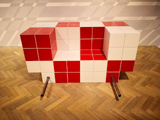
You'll not be surprised to know I was bewildered. Although some of the art (the flowers, the butterflies mainly) looked impressive I had no idea what it was all supposed to mean. Anthea Hamilton's The Prude (for that is the artist and the exhibition in question) takes places over two small galleries on Duke St and when I read in the bumf you can pick up on the way in that she "frequently mines heterogeneous image sources" my heart sank a little.
Whose wouldn't? They've been mining heterogeneous image sources round here for generations. My dad was a heterogeneous image source miner, my grandad was a heterogeneous image source miner, and we've even been able to trace heterogeneous image source mining back eight generations. It's the family trade.
What I'm saying, in a style that my English teacher at school would have dsimissed as flippancy, is that the idea of heterogeneous image sources is something of a cliche. It's just more alphabet fucking soup and when you've been to as many galleries as I have, read as many press releases as I have, it all starts to taste the bloody same.
But I soldiered on. I'm a committed blogger and someone has to write these things so they can sit on the internet and be ignored. They don't just write, and ignore, themselves. The show, in theory, is about the 'prude'. The prude is someone for whom modesty becomes extreme. The prude, we are told, is someone who will not permit either themselves or others any sensuous enjoyment in this life. The prude, we read on, could be somebody like Cecil Vyse in E. M. Forster's Room With a View, someone who affects to be a sensitive individual, an aesthete, but, in fact, remains detached from lived experience.
It's an interesting enough idea to base an exhibition around but it's really hard to see what this show says about the state of prudishness. I've not titled the works because it's not clear from the literature which works are which but the titles may give you some idea of Hamilton's mindset (also bear in mind that Hamilton was responsible for the giant golden bum entered for the Turner Prize 2016 - if you'll pardon the expression):-
Walnut Way Wizened Boot
Slanted Tartan Scramble Chair #01
Wavy Socks and Sandals Boot
Wrestler Sedan Chair
Folded Wing Moth
There's also a lot of works called RPD (followed by some sort of catalogue number) so make of that what you will. I just scratched my head, took some photos, and continued round. If art requires an accompanying leaflet to explain it then that leaflet better be interesting but this one, which rambled on endlessly about Ed Ruscha gradients, fundamental economies, processes of realisation, and tactile surfaces conceived through digital production, was so dull it made the already (mostly) unimpressive art even less interesting than it already was.
Dry exercises like this are exactly the kind of thing that puts more people off engaging with art and galleries. I was well into my thirties before I even worked out that people like me, not in the industry, were even allowed to enter these precious commercial gallery spaces. I do it now with glee and often and sometimes I get a wonderful surprise. Often, it's rather dull. This fell, most definitely, into the latter camp.
Most of the works on show just made me think the whole art world is one giant con where the ability to back up your creations with a load of bullshit words is far more important than the actual work itself. These works, for the most part, were neither aesthetically pleasing, they weren't (in any way) challenging, they had nothing to say about the times we lived in, and they elicited no emotion from me whatsoever.
So, thank Anthea Hamilton for her butterflies at least. They look pretty. But that's because butterflies do look pretty. Same for the big orange flowers. Same for the tiling.
I can't say that Anthea Hamilton hadn't put any effort in to her art. She clearly had. But her efforts seemed pretty directionless. Unless the direction intended was straight to the bank because with this display I really can't see what else was intended other than to trick the rich guardians at the doors of the art world to part with some of their not so hard earned cash.
Disappointing - and not one giant golden bum in sight. Just the shit that came out of it.


No comments:
Post a Comment