They're coming home, they're coming home, TADS are coming home.

Much like Harry Kane, Raheem Sterling, and the rest of the England football squad, four TADS went to bed this Saturday feeling tired but happy, elated even, with a feeling of a job done well and a sense of excitement about returning to 'work' again in August when TADS head to Llangollen in Wales for their annual two day spectacular.
I was proud that, in my own small way, I was their Gareth Southgate but, as with Southgate, I'd be nobody without a strong team - and that I had. Even if it was a considerably smaller one than that which strode from Rye to Camber Sands and back last month. Just the four of us. I like it when we have large numbers but, logistically speaking, it is easier in some ways when the numbers are fewer.
I took the Overground from Honor Oak Park to Canada Water and the Jubilee line to Stratford where I met Shep, Adam, and Pam already on the platform. We'd planned to get the 1052 to Benfleet but as we were all over half an hour early we jumped on the 1022 and, after stops in places like Barking, Upminster, and Basildon, were in Benfleet by eleven on the dot.
It was there we witnessed a man in a slightly disturbing choice of Covid mask. A huge bag not unlike the one that was used by The Elephant Man. We presumed he had an inordinately large beard inside it and referred to it as his 'beard bag' - until he removed the mask/bag to reveal a clean shaven face.
There was something eerie about the chap. Luckily, he was soon far from our mind as we wandered along Canvey Road looking out to the muddy banks of East Haven Creek complete with rusty boats, a half submerged office chair, and several gulls and, we think, ibises. We crossed the creek on to Canvey Island proper and soon took a footpath to our left that led us into Dauntless Boatyard and what we hoped would be a solid breakfast/brunch/lunch in a Portakabin with the slightly misleading name of the Waterside Cafe.


It was not the only misleading thing about it. I'd checked in the days, and hours, before the walk that the Waterside Cafe was open and the Internet told me it was. Once we'd looked around some tractors, industrial plants, old boats, and rusty vintage cars it became obvious that the Waterside Cafe was closed. A couple of sad tables sat on some decking near a locked door. Questions to local office workers (in the other end of the same Portakabin) proved equally fruitless when it came to sourcing food.
Adam had brought sandwiches and shared them with Shep and Pam (though not me - I hadn't eaten all day but I didn't mind, I knew we'd find somewhere soon enough) and we set off along the northern side of Canvey Island. To our south a golf course, to our north a large concrete flood wall over which you could see a maze of small streams and brooks running through marshy fields. Beyond that the surprisingly verdant green hills of Essex.

Canvey, the second largest island in the Thames after Sheppey, is 7.12sq miles of reclaimed land with a population of over 38,000 and has been inhabited since the Roman invasion of Britain. It is believed that salt was once taken from Canvey to Chelmsford and Colchester and when the Saxons settled in the area and developed Essex agriculturally, sheep farming became the island's chief industry.
It remained so until the 20th century (the ewe's milk was even exported to France) and place names on Canvey Island ending in 'wick' come from the sheds where the cheese was made. It is believed that the name Canvey Island means 'the island of Cana's people' but it is uncertain who Cana actually was.
Canvey was passed between various royals and nobles for centuries (Henry de Essex, Henry II, and John de Apeton to name just three) and in the 14c the first attempt at protecting the island, its people, and its livestock from frequent Thames estuary flooding began. For the next three hundred years, however, the island's people and sheep would have to regularly huddle together on the few hills (and, to be fair, we saw none all day) as the rest of the island disappeared underwater.
In the 17c the island was walled with chalk, limestone, clay, and Kentish ragstone and drainage ditches were dug. Many of those involved were Dutch engineers who then settled on Canvey and, even now, one third of the island's streets have names of Dutch origins. These 'walls' still exist, now topped with a modern (and so tall you can rarely see over it) concrete wall, and they give the island an odd aspect. Houses that feel as if they should look directly out to the sea, or estuary, instead stare out blankly at huge grass verges, fences, and concrete. Some of the houses, at least on the eastern side of the island, seem almost too fancy for such an unsatisfying result.


As the path got wilder and curled back in and around Tewkes Creek, the map on my phone told me we were approaching Anita's Tearooms - and we were all still hungry. The sign looked promising - and Anita's did not let us down. There was an option of sitting in (a Portakabin of course) or sitting out among the garden furniture, shrubbery, and flowers that gave the place the feel, not unpleasant, of a suburban garden centre.
Adam ordered the biggest cup of tea they had (and got it - in Del Boy's Lovely Jubbly mug), Pam had a veggie breakfast, and Shep and I had chips and beans. Some of the biggest chips I'd ever seen and some of the biggest beans I'd ever seen. Even the bread that came with it was, of course, of the doorstep variety. Even a brief shower, it had been surprisingly hot earlier, couldn't ruin this unexpected feast although the man who was in Anita's single toilet for the duration of our stay certainly annoyed some cross legged walkers.


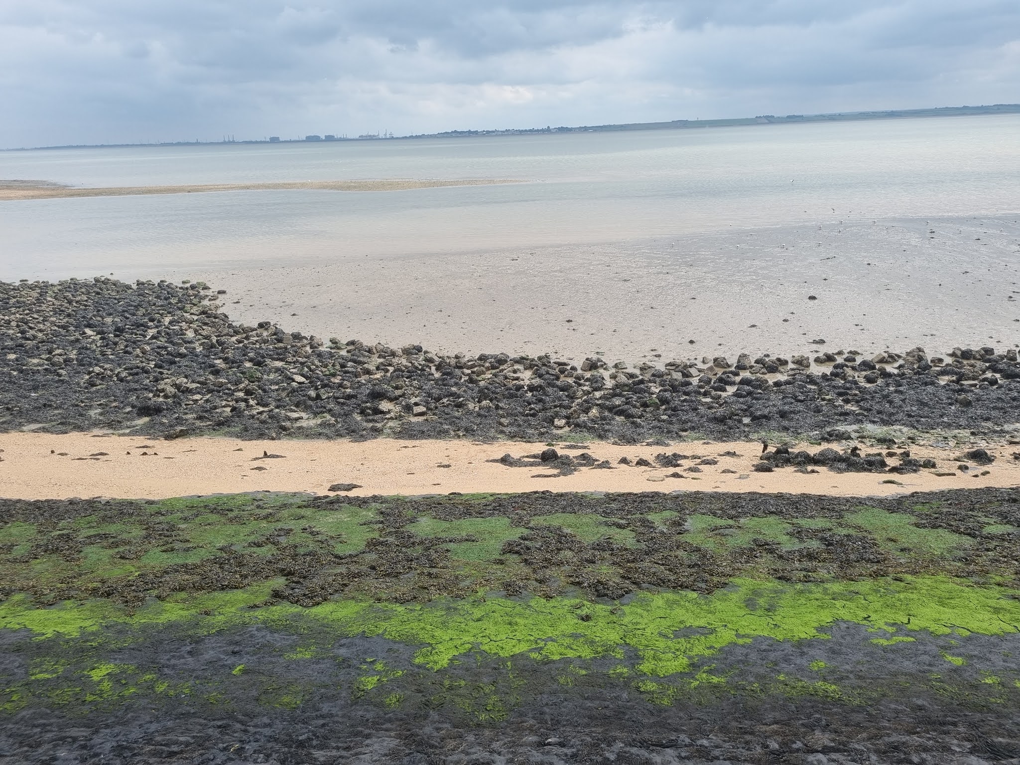
He could be heard yakking away on his phone from the Portaloo. Perhaps he should have prioritised having a shit. We gave up waiting and headed on. Past the Island Yacht Club with views of Southend and it's world record length pier on the horizon. Soon we reached a corner of the island and took a right along the even more resilient fortifications that face out towards the Thames. You can walk either side of them (though presumably not at high tide) and we mixed and matched so we could both enjoy the view of large cargo ships passing on the broad and majestic grey expanses of the Thames, with views across to the Isle of Grain, and also so that we wouldn't miss the Windjammer pub which I'd pencilled in for our next stop.
It wasn't long before we spotted the pub. Popular with pensioners would be one way of describing it. They didn't take cards (in 2021!) and only Pam had enough cash to buy a round but my Moretti went down well in the early afternoon sun as we sat on the patio gassing away and laughing about overhearing a passer by describe Pam as "that bird in burgundy".


The Thames estuary is picturesque yet slightly industrial here and it would become more of a 'working' beach again soon but, not long after the Windjammer, you reach what passes as Canvey Island's attempt at a seaside resort. To be fair, it's modest - but I still liked it. A couple of penny arcades, some bumper cars, a few fast food joints, and a couple of sports pubs including the surprisingly tempting looking Art Deco styled Monico.
This modern iteration of Art Deco had been more lovingly looked after than the nearby, and far more important in terms of architectural history, Labworth Cafe. The Labworth was built in 1933 by Ove Arup, a Danish-English engineer who was also involved in Highpoint in Highgate (with the architect Berthold Lubetkin), Sydney Opera House (with Jorn Utzon), and Centre Pompidou in Paris (with Richard Rogers and Renzo Piano) and worked in the International Style of Le Corbusier, Van Der Rohe, Gropius, and Aalto.
It's a small piece of modernist architectural history and it's sad to see it up boarded up, a victim of the decline in the popularity of English seaside holidays even if in 1996 it was awarded a Grade II listing by English Heritage and plans were supposedly made to, like the Delawarr Pavilion in Bexhill, restore it to its former glory.

Perhaps, in some ways, that wouldn't feel right. Canvey Island has a feel of former, or faded, glory no matter where you look. Despite proud boasts about THE GREAT BRITISH COAST, the sand is hardly golden and most of the benches, all but one in fact, dotted around what passes as its beach were vacant.
Canvey Island has been unlucky more than it's been lucky over the years. On the 1st February 1953 the North Sea Flood killed fifty-eight people on the island, many in holiday bungalows in Newlands. The total death toll was 2,551. Mostly in the Netherlands (where 9% of all Dutch farmland was flooded) but fatalities occurred in Belgium too, as well as in Suffolk, Norfolk, Lincolnshire, and even as far north as Scotland.
Thirty thousand animals died and ten thousand buildings were destroyed. On Canvey, The Red Cow pub (a mere two foot above sea level) survived the flooding and was renamed the King Canute in tribute but more significantly for those living there a new seawall was built. One which was enlarged again in the eighties and, seemingly, for now at least - climate change notwithstanding, is doing a good job at keeping the islanders and visitors like us safe.

Most of the south western part of the island is given over to the petrochemical industry (particularly it seems - a firm by the name of Oikos) and has been since the 1930s. In 1979, the IRA attacked Canvey's Texaco oil terminal and in 1997 Safeway hired the celebrity steeplejack Fred Dibnah to demolish a 450ft high concrete chimney in their refinery.
This was to be a big event and crowds were expected to gather but, alas, the day before Dibnah's feat was due the chimney fell down of its own accord. Now, it's a mostly forlorn looking section. Static caravans in an utterly soulless and fenced off estate look more like prisons than holiday homes and many of the gasholders are covered in rust. The offices, too, have been left to be reclaimed by nature.
At times it felt we were heading in the wrong direction here, although an unexpected climb up a rusty ladder was exhilarating, but as the coastal path and wall slowly curved round we finally reached the Lobster Smack pub. A pub I had expected to be, at best, unimpressive (bearing in mind its surroundings and location). A pub I would not have been surprised to find either deserted or boarded up.


Instead it was an absolute joy. In the 1850s it had been the home of bare knuckle boxing bouts, some of which would last for three hours and involve sixty rounds, and was frequented by smugglers so infamously that Dickens featured both the inn and the smugglers in 1860's Great Expectations. It seems likely it would have had another boost too in the 1930s when Canvey became a fashionable resort and was believed, even, to have healing properties.
Casinos, arcades, and funfairs were built and Londoners were encouraged to relocate and buy dream homes here, starting a cockney diaspora. With pubs selling pints for £3.50, you can see the appeal. We sat in the Lobster Smack's delightful and spacious beer garden, listening to The Buggles Video Killed the Radio Star, drinking Peroni, and, inevitably, making a very enjoyable two pint mistake.
I, of course, took the opportunity to reel off a list of CI notables and folklore. Residents of Canvey have included Robert Denmark (7th in the 5000m in the Barcelona Olympics of 1992, behind Dieter Baumann of Germany), Dean Marney (the ex-Tottenham, Hull City, Burnley, and Fleetwood Town player), Dean Macey (4th in the decathlon at the Sydney Olympics of 2000 - behind Erki Nool of Estonia and, again, 4th four years later in Athens behind the Czech Roman Sebrle), and Peter Taylor (former manager of/and player for both Crystal Palce and England).
Local folklore tells of a ghostly Dutchman carrying a sack around the norther parts of Canvey (could it be beard bag man?), a 'lady of the lake' who haunts the island after drowning near here, a tall burly Viking spectre who was left behind by his fleet, the phantom of a vanishing nun, the ghost of a 'black man' who offers a price for your soul, and one last ghost - a 'white lady' who will ask you to dance with here.
We didn't see any of these characters but on the long, and now really quite warm, walk back to the north of the island we did pass the two 17c Dutch cottages that had been built over four hundred years ago by immigrants working on the island's sea walls. The pink one was particularly pretty and that's why it's now a museum. The white one has recently been sold.
I would have loved to have had a nose around inside these fantastic houses but time was tight (and they weren't open to the public anyway) and we arrived in Mumtaz Mahal in Benfleet over half an hour later than planned (I'd phoned ahead and they were okay with that) and once it was established that Shep would not be able to have either Bangla or paneer shashlik, I ordered a brace of Cobras, Bombay aloo, turka dall, and a chapati and shared some pilao rice with Adam. It was delicious but it still defeated me (I don't know why but I am struggling to eat large meals these days or even medium sized ones).
The service was friendly and the conversation, of course, was interesting and funny too. When the staff celebrated Harry Kane's first goal against Ukraine in the Euros quarter final we had to decide if we were going to watch it. I think I wanted to the most but we all decided we'd try one of the local pubs, feeling certain they'd be fully booked.
Amazingly, the first one we tried, The Anchor Inn had a spare table (for four) in front of a large screen. We had a couple more beers as we watched Harry Maguire, Jordan Henderson, and, for the second time, Harry Kane put England 4-0 up and into a semi-final with Denmark on Wednesday. It was an amazing performance and a real novelty to watch England play a game of knockout football with the stress off.
As we walked back to the station, the temptation to launch into Football's Coming Home was tempting. But so would it have been to break into British Sea Power's Canvey Island ("oh, it's happening now") or something by local pub rock legends (Canvey Island is good for pub rock and Brit funk) Dr Feelgood. Something like Going Back Home perhaps.
On the train back to Stratford, Shep and I had another beer and Pam was propositioned by a very drunk man who boasted they called him the "five minute man". In Stratford itself, Pam left us and I took the Jubilee with Adam and Shep. I left them at Canada Water and headed back to Honor Oak Park. By the time I got home I'd clocked up 34,008 steps (a 2021 record, beating the 32,682 registered on the Wandle a fortnight ago).
I'd set a record, England had set a record (biggest win ever in the knockout stages of a tournament) and all of us had had a rather lovely, and quite unusual, day out. Thanks to Pam for the snaps used in this blog (as ever) and thanks to her, Shep, and Adam for spending this day with me. TADS have got the world in motion and even though, like football, they're coming home - they'll be out and about again soon.

 Posts
Posts