Wednesday, 5 April 2017

Robert Rauschenberg and the subversive language of junk.

I'd left it late to get along to Tate Modern's large Robert Rauschenberg retrospective. Back in December I'd invigilated at a small, complementary, show of Rauschenberg's works at the Offer Waterman gallery in Mayfair (which had the surprising side effect of making my parents actually watch a TV documentary about modern art). After 77 hours immersed in his art I thought it might be an idea to give it a break before attending the Tate show. I wondered if I'd become fed up. I needn't have. It was a joy from start to finish.

Rauschenberg famously said that he wanted to create "in the gap between art and life". That both explains his work and makes him sound a little pretentious but he was no moneyed dilettante born with a silver art shaped spoon in his mouth. Born in Port Arthur, Texas in 1925 to Fundamentalist Christians the young Rauschenberg, dyslexic and gay (if not openly for some years), seems to have been a disappointment to his father with the elder man, on his deathbed, informing the younger one just that.

Much like many who feel unloved and unappreciated Rauschenberg was forever striving, always changing, the cod psychologist in me would suggest he was seeking substitute love for the paternal affection that seems to have been in such short supply. It's hard to imagine his dad being particularly impressed with much of his son's work though. It's simply too avant-garde, too ahead of its time.


Automobile Tire Print (1953)
Port Arthur wasn't the sort of place where you became an artist and the young Rauschenberg never imagined he could become one. He didn't visit a gallery until his mid-twenties after he'd already been drafted into the navy. Navy life afforded him a chance to travel and in Paris he met Susan Weil whom he later married. Both of them enrolled at Black Mountain College in North Carolina. There Rauschenberg studied under the Bauhaus teacher Josef Albers who encouraged his students to work with the everyday stuff they found around them. When Rauschenberg, some years later, got his friend John Cage to drive his Ford Model A across a canvas the lessons of Albers must've been on his mind, both as someone who'd inspired him and as someone he was reacting against. Rauschenberg, more so even than Pollock, had made an artwork that did not involve his own hand.
It was playful too and that seems to be a key, oft overlooked, element in Rauschenberg's work. Moving to a studio in downtown Manhattan Rauschenberg slowly, assiduously, erased an entire Willem De Kooning drawing. Despite still being wed to Weil he began a relationship with fellow artist Cy Twombly and as they travelled around Spain, Italy, Morocco, and Cuba Rauschenberg tested the limits of abstraction. Of patience too some might say. His White Painting of 1951 was said to be an inspiration for John Cage's 4'33 as well as a reaction to the earnest abstract expressionism of Barnett Newman and Mark Rothko. His gaze fell on his lover and he took lots of photos of Twombly descending staircases while, at the same time, making elemental sculptures of dirt, stone, glass, and string scavenged from Staten Island.


White Painting (1951)
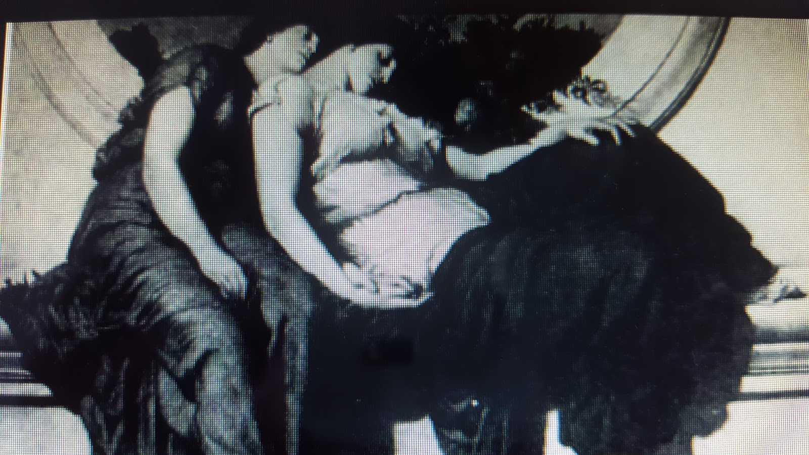

Charlene (1954)
Rauschenberg wanted to bring the outside world into his work. Newspapers and comic strips were applied to canvas and reflectors, electric lights, mirrors, and umbrellas started to appear. Not renderings of them but the actual things. These were the foothills of his career preparing us for the mountains of his combines. Critics dismissed his work as 'funfair fodder' but Rauschenberg didn't let them hold him back. He forged forward with new, and brave, ideas. Always interested in the collaborative nature of art he worked with composer Cage and dancer Merce Cunningham (Cage's lover) on Minutiae, a dance piece inspired by people Rauschenberg had observed on the street.


Yoicks (Red Painting (1954)


Monogram (1955-1959)
This interest in real life as it was actually lived was expressed in a quote from Rauschenberg:- "A picture is more like the real world when it's made out of the real world". This helps us to understand why he made these combines. By 1954 he felt his paintings had become 'awkward physically' and sought to expand on his ideas. He noted that most artists who'd used collage and found materials aimed to represent something else. Rauschenberg was quite happy for the object to simply 'be itself'.
There was generosity in his work too, unless you're a goat of course. Short Circuit managed to sneak both Jasper Johns and now ex-wife Susan Weil, who'd both been rejected, in to the Stable Gallery behind specially created 'windows' that swung open to reveal his friend's art to now be part of his.


Short Circuit (1955)


Gift for Apollo (1959)
As his confidence grew so did the size of his works and the list of materials incorporated within them. Ladders, socks, calendars, alarm clocks, springs, electric fans etc; One work even contained radios that visitors could tune to radio stations of their own choice. In Bed he used a patchwork quilt as a base for his work because he claimed not to be able to afford a canvas. Some found it grotesque. Others suggested they'd like to get inside it for a nap.
When asked a question during a Japanese TV interview Rauschenberg, instead of answering in words, simply created a combine on the spot. It was suggested to gallery attendees that, if they wished, they could remove some of the components of the artwork but only if they replaced them with something else. This was Rauschenberg's collaborative nature, generosity, and frontier spirit gone nuclear. I'm not sure security at the Tate would've been happy if I'd decided to avail myself of a ladder or two.


Bed (1955)


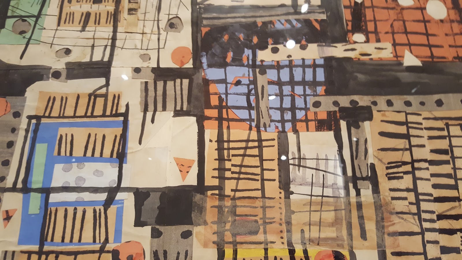
Glacier (Hoarfrost) (1974)
The Offer Waterman show I had very minor involvement with focused on Rauschenberg's transfer drawings. In comparison to the combines they're a very low key, sotto voce, aspect of his career but they help you to see the wider picture. To see how the man valued the small gesture as much as the large one. Using lighter fluid and empty ballpoint pens he was able to transfer images from one sheet to another. Sports stars and politicians of the day were incorporated alongside confusingly coded messages and historical works like Dante's Inferno.
By the early sixties some of the ideas behind the transfers had found their way into his larger silkscreen work. Helicopters, eagles, JFK, street signs, space hardware, and the Statue of Liberty were among the American icons that populated his work at that time. The silkscreens proved to be Rauschenberg's breakthrough and, in 1963, he was given his first major survey, held at the Jewish Museum in New York. There followed a show at the Whitechapel in London which broke attendance records. A year later, while on tour with the Merce Cunningham Dance Company, he became the first American to win the painting prize at the Venice Biennale. Many were shocked and outraged but, seemingly, none as much as Rauschenberg himself who, the very next day, asked his assistant to destroy any silkscreens that were left in his studio!


Scanning (1963)


Retroactive II (1964)
Rauschenberg's relationship with Cage and Cunningham temporarily broke down and, now living with the dancer Steve Paxton, he helped found the Judson Dance Theater. An organisation which embraced process, collaboration, and 'everyday action'. Three of Rauschenberg's favourite things.
Certainly how he interpreted that remit was pretty odd. There were turtles wandering around with torches strapped to their backs, tap dancing, people ripping pages out of phone books, a shopping trolley full of alarm clocks, 'brides' with clocks stuffed down their bras, and Rauschenberg himself parading around on stilts like a demented ringmaster.
Participants, in a nod to Dada, read newspapers backwards loudly and a woman in a burlap sack was placed on stage to sing an old Spanish folk song during the middle of a tennis match. If this sounds like Rauschenberg had let the fame go to his head it's as nothing compared to his Portrait of Iris Clert. It's as arrogant as it is genius and it's as small as Oracle (started just a year later) is grand. The Clert portrait seems to show us who Rauschenberg has become while the sculpture seems to hark back to who he once was, where he came from. There's something of the ol' Texan farmhand about it. 


This is a Portrait of Iris Clert if I say so (1961)


Oracle (1962-1965)
Now a big name Rauschenberg was commissioned to create a Time magazine cover. Signs (from 1970) was ultimately rejected but it's good to see that Rauschenberg was paying respect to fellow Port Athurian Janis Joplin who would go on to die of an overdose just one month later.
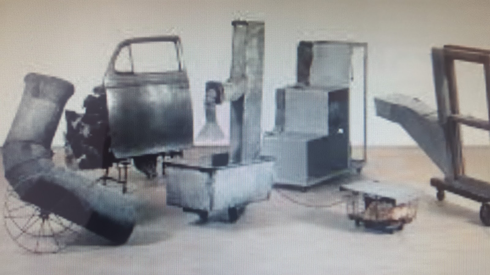
This room is dominated by Mud Muse, a large metal tank that contains 1000 gallons of clay mixed with water. It bubbles and spurts as air is released and I felt a strong desire to throw a coin in and make a wish. A wish for something 'dirty' and not for the first time. Around the same time Rauschenberg, and this illustrates how famous he'd become, was asked to create a drawing for a microchip to be sent to the moon. Along with Andy Warhol and Claes Oldenburg Rauschenberg's art would be the first to go, literally, lunar.


Signs (1970)


Mud Muse (1968-1971)
It was as if space travel and fame were all becoming a bit much and in the seventies he scaled back his work in some ways. He moved to Captiva Island, off the Gulf Coast of Florida, and set about making cardboard sculptures. They're a bit drab after the combines and if the series of 'windjammers' he made after visiting the textile city of Ahmedabad in India were more abundant in colour they still seemed to represent Rauschenberg wandering too far astray of his comfort zone. Something that normally worked for him but not really this time.


Volon (Cardboard) (1971)


Quarterhorse (Jammer) (1976)
He got his mojo back in the eighties when he visited the oldest paper mill in the world in Anhui Province, China. On becoming aware of the crippling restrictions enforced on the Chinese people (which still didn't stop him putting Deng Xiaoping on the cover of Time magazine in 1986) he decided to create a series of artistic dialogues with countries around the world including those with regressive governments. The Rauschenberg Overseas Culture Interchange (ROCI) ran from 1984 to 1990 and took in the USSR, China, Japan, Malaysia, East Germany, Mexico, Chile, Cuba, Venezuela, and Tibet. One work from the series would be donated to a museum in whichever nation was hosting and the rest would travel on to the next exhibition culminating with a presentation at the National Gallery in Washington DC in 1991. Eventually over 2,000,000 people saw the show.
Whilst one eye was out on the wider world Rauschenberg kept another on events at home. On a rare visit back to his home state of Texas he was taken by the effect the oil crisis had had on the landscape of a once prosperous state. In acknowledgement of this he made the elegiac Glut series from discarded gas station signs, oil cans, and automobile parts. Around the same time as all this he somehow found time to design the artwork for the Talking Heads 'Speaking in Tongues' album.


Glut Data (1986)


Stop Side Early Winter Glut (1987)


Yellow Ranch (Rancho Amarillo), Roci Cuba (1988)


Untitled (Spread) (1986)


Holiday Ruse (Night Shade (1991)
Towards the end of his life (Rauschenberg died in 2008) photography became an important part of his work. Working with a team of assistants he made large scale work using inkjet printers and digital image storing. Even in his dotage Rauschenberg was embracing the new. Even when a stroke paralysed his right hand in 2002 he simply got his friends to take photographs for him so he could mix them in with his own bank of images.
It's this restlessness, and desire to create, that marks Rauschenberg out as one of the heroes of 20th century art. In the Offer Waterman gallery I'd hear them repeat the line, attributed to Jasper Johns, that Rauschenberg was the American Picasso. It seemed fanciful at the time but in the breadth of his work, his ability to be influenced by everything and, in turn, influence everything, and in his questing and exploratory nature I think that they, and Jasper Johns, might just have been on to something.


Triathlon (Scenario) (2005)


Untitled (Scenario) (2006)

Monday, 3 April 2017

Flaming June (smouldering March).

On a not so flaming, but perfectly lovely, day right at the end of March I ventured back to Holland Park to see how the other half live. Very well it would seem. The houses, mansions in many cases, round there are gorgeous, and speak of great wealth, although Lord Leighton's old gaff may be one of the nicest of them all. That was the one I'd come to see.

Well, that and Leighton's acknowledged magnum opus Flaming June which was enjoying a short break from its usual home the Museo de Arte de Ponce in Ponce, Puerto Rico. Quite an unusual place for such a European classicist work to end up. It turns out it's whereabouts was a mystery for many years before the Puerto Rican industrialist and philanthropist purchased it as a gift to his nation.

On the whole Frederic Leighton's work doesn't do a lot for me. I find it stuffy, academic, regressive even. Flaming June is a different matter. It may just be down to me being a randy old goat but there's no denying the sensuousness of that expanse of thigh or the hint of pert breast beneath the diaphanous orange gown. However, as much as I commend the rendering of the female form and the bold colours I must also remark upon the masterful depiction of the drapery and its folds. The shimmering Mediterranean sunlight, too, is an absolute marvel. How I'd love to be on that boat sipping a glass of Rioja and letting my hand dangle in the sun baked waters.

 
Flaming June (1894-1895)
 

I wasn't though. I was in London W14. In the Leighton House Museum. A Grade II listed building that was Leighton's home until his death in 1896. The restrained red brick classical exterior gives no clue to the wonders inside (that you're not allowed to take photographs of). Inspired by Sicilian, Turkish, and Syrian styles there's an Arab Hall, turquoise tiling galore, a stuffed peacock if that's your thing, whilst Leighton's works (and a few Old Masters) adorn almost every wall. There are fir cones placed on seats or cushions to prevent you sitting down but that didn't deter either The Stranglers or Spandau Ballet who filmed their videos to Golden Brown and Gold here. Plus I have it on reliable authority (my friend Jackie who is a treasure trove of information) that The Communards used it too.


Lachrymae (1894-1895)
 
Leighton, who 'never married', was born in Scarborough in 1830, educated at UCL in London, and in his younger life travelled in France, Germany, and Italy. In Frankfurt he painted the gloomy German philosopher Arthur Schopenhauer and in Paris he came into contact with leading French artists of the time such as Corot, Ingres, and Delacroix.
 
Back in the UK in the 1860s he was knocking about with, if never quite part of, the Pre-Raphaelites and, in the next decade, received a knighthood from Queen Victoria. This hobnobbing with the establishment and loose affiliation with the backward looking Pre-Raphaelite Brotherhood don't endear me to him and in works like Candida and Maid with the Golden Hair you can see just how far Britain had slipped behind France at the time in terms of progressive art creation. It's not that they're bad (technically they're superb) but more so that they lack imagination. Proto-Stuckism. 
 
It's hard to imagine now that in 1895 when Leighton sent these two paintings, along with Lachrymae, Twixt Hope and Fear, Flaming June, and one other oddly missing from the show off to the Royal Academy he hadn't marked out Flaming June as the best work. Like a band who'd recorded an entire album but couldn't tell which song to release as the single he was, perhaps, too close to the work to see what was apparent to any fresh pair of eyes. 


Maid with the Golden Hair (1894-1895)


Twixt Hope and Fear (1894-1895)


Candida (1894-1895)
 
The exhibition itself was tiny, there were studies and tracings for Flaming June and the other paintings and the paintings themselves but not a lot else, so I took in more of Leighton's work around the rest of the house. The nymph Clytie, abandoned by the sun god Apollo, was left unfinished at the time of Leighton's death (in 1896 of angina pectoris just one day after becoming the first painter to be given a peerage) and has been interpreted, perhaps fancifully, perhaps not, as Leighton's own raging at the dying of his light.
 
Summer Moon, painted a full two decades before Flaming June, suggests a similar balmy heat but its monochrome form denies us the bright colours that are so important to the later work. It's a similar story with 1894's Summer Slumber in which Leighton seems to be toying with various poses and settings that would later be perfected in Flaming June. It could almost be regarded as a preparatory sketch. I'd swipe left on Summer Slumber but right on Flaming June.


Clytie (1896)


Summer Moon (1872)


Summer Slumber (1893-1894)
 
His Algerian courtyard scenes aren't shy of aping the exoticising Orientalism of Delacroix. Although it's hard to imagine it's anything other than a highly sanitised take on Algiers it is a small delight - and its a mystery why the curators of Leighton House Museum have half of it shaded by a curtain in an easily missable corner of the Silk Room!
 
This was a pleasant trip and a decent (if somewhat dry and academic) exhibition. It hasn't changed my mind about British 19c art and its stuffiness completely but it did open me up to the fact that somewhere within the highly formal, establishment friendly environment of the late Victorian age there were artists who were prepared, if only occasionally, to be brave, to look to Europe, and to look to the future. With this in mind it seems quite apt that Flaming June should've ended up in Puerto Rico. If anyone would like to pay for me to go over there and write about how if fits into that setting I'd be more than happy to do it. Ponce looks like it's flaming June every day in a way that even lovely Holland Park can't replicate.


Courtyard, Algiers (1895)

Sunday, 2 April 2017

Here's the science bit.

Another great evening in The Bell with the London Fortean Society and editor-at-large of the Londonist Matt Brown. Matt's an amiable guy who used to be an actual proper scientist so he knows what he's talking about even if, in absent minded professor style, he sometimes takes a while to remember what it is.

That only added charm to a fascinating and instructive evening. Unlike other Fortean talks Matt's 'Everything You Know About Science Is Wrong' put aside a narrative structure and simply focused on a quickfire debunking of a few, quite a few, popular science myths. Matt knew he was being pedantic and nit-picking with a lot of this stuff and he made no excuses for it. He was doing it for fun though. Not some kind of "I think you'll find" approach like that patronising friend most of us have who are more than happy to highlight the gaps in our knowledge and delight in demonstrating their intellectual superiority.

Matt wore his intelligence and knowledge much more lightly than that even if he couldn't help, at times, making sport of it. A favourite ruse of his was to refer to the large clock in Westminster as Big Ben. Normally within seconds someone will be on his site to exclaim "I think you'll find Big Ben is the name of the bell and what you're referring to is St.Stephen's Tower". Except this received wisdom is untrue. The tower is the Elizabeth Tower and Big Ben is merely one of several bells that peal out across the Thames.


This is in Everything You Know About London Is Wrong book. One he enjoyed so much he followed it up with the science one. He took to task the myth of the right brain/left brain, confirmed you absolutely couldn't see the Great Wall of China from space, and gave Rosalind Franklin her rightful place alongside Crick and Watson regarding her research into DNA.


Aviation history appears to be riddled with myths. The Montgolfier brothers weren't the first up in a hot air balloon. They invented them but sent someone else up as they'd promised their mum they wouldn't place themselves in peril. Neither were the Wright brothers the first to seemingly defy gravity and take a machine heavier than air into the sky.

That was Sir George Cayley, a remarkable engineer, and Whig MP, from Scarborough, who, as well as flying around in gliders in the 1850s, invented both the seatbelt and the spoked wheel. Show off!


I felt Matt could've cut Yuri Gagarin some slack but even the cosmonaut came in for a kicking. Of a very jovial nature. Tortoises beat him into space (they'd sent a hare first but so far ahead was he he stopped for a rest, nodded off, and was pipped by the slowcoach reptile) and Yuri didn't even complete a full orbit of the Earth.


Long admired mountains suffered the same downfall as long admired men. Yeah, Everest is the tallest mountain on Earth if you measure from the ground but what if you start in the ocean? Then Hawaii's Mauna Kea is bigger. Other planets too boast higher peaks. Famously the volcano Olympus Mons on Mars but even that's dwarfed by the asteroid Rheasilvia.


There was some more confusing stuff about epigenetics and string theory. Matt posited that we may not be who we think are. Leaving aside the 50% of us that is water and the gradual renewal and ongoing replacement of our organs (I like to call this Trigger's Broom) a lot of our DNA gets swapped in the womb with our mother's and our sibling's. This recently discovered flux in our make up has caused some scientists to ask if this makes the offsprings of alcoholics or smokers more likely to become addicts themselves as the parent's DNA adapts to cope with the addiction and is then passed on to the child. The science isn't decisive but that's the nature of science. Things don't stay the same. They develop with new learning and discoveries. That's why it beats religion every time.

String theory is so complicated it's said anyone who claims to understand it must be lying. Some definitions claim for it to work it must involve 10, 11, or even 26 dimensions. Matt's attempt to simplify it was questioned by audience members and a heated debate was had. Later there were heated debates about tesseracts and gonorrhea. It was that kind of evening. The kind I like.

On the subject of heating, water doesn't usually boil at 100 degrees. It's around there but specifics depend on location and conditions. Paris is your best bet to hit the century on the head as that's where they did the tests. Up mountains, on the poles, or in space results will be very different indeed.

Matt was asked if the rise of stupidity, fake news, soundbites, and meme culture would make scientific knowledge, and pedantry, obsolote. If we were hurtling towards a new dark age essentially. But he remained positive that the pendulum would swing back to facts and experts soon enough. I share his hope but it's up to us to do our own fact checking from time to time if we want this to happen - and this was just such an exercise for me.

So, even though I didn't know that much about science in the first place, it turned out much of what I did know was wrong. On top of that I learnt a few facts to either bore or impress people with in pubs in the future. Matt Brown impressed, rather than bored, me.

Eduardo Paolozzi:The godfather of Pop Art?

The Whitechapel is more relaxed than a lot of other galleries. They let you take photos for a start - and they don't give you too much to read. Which allows you to focus your eyes on the art itself, the things you've actually come to see. In the case of their current Eduardo Paolozzi retrospective much of that was a joy to behold.

They're styling him as "the godfather of Pop Art" and whilst the exhibition may not be completely decisive he's as much of a claim on that title as anyone else. Certainly his voracious appetite for appropriating pop culture influences and blurring the boundaries between the brows high and low is here for all to see.

Paolozzi was born in Leith, Edinburgh in 1924. The son of Italian immigrants who ran an ice cream shop he was, like most Italian men in Britain at the time, interned during the war. He was one of the lucky ones. His father, grandfather, and uncle were among over 400 Italians drowned when the ship deporting them to Canada, the Arandora Star, was sunk by a German U-boat in 1940.

Paolozzi was sixteen at the time and there can be no telling how that affected him. Three years later, with the war still raging, he began his studies at the Edinburgh School of Art. A move to London saw a brief spell at Saint Martin's and a longer one at the Slade (it seems like everyone went there) before his travels took him to Paris where he met, and came under the influence of, Constantin Brancusi and Alberto Giacometti.

You can see it in his early sculptural work and it'd probably be fair to say that vestiges of these influences, and those of Braque, Leger, and Picasso, could still be found across his ouevre until the very end.


Fun Fair (1947)


Collage (1951)
 
In 1947 Paolozzi held his first solo exhibition at London's Mayor Gallery. A collection of drawings, collages, and concrete sculptures many of which have been gathered together at the Whitechapel show for the first time since the 70s. His choice of concrete as a medium, at the time considered to be for 'working men', helped distinguish Paolozzi from his more conservative sculptural predecessors. The boldness in choosing material was matched by a general boldness of aesthetics and attitude and helped earn Paolozzi a reputation of an artist of international repute.
 
He embraced life in Paris and waxed lyrical about how it was "perfect, colourful, after the grey life of London". It seems unlikely he'd have voted for Brexit. Paris's title as home of the avant-garde art world was soon to be wrested away from it by New York but in the post-war late 40s it still clung on to its reputation and Paolozzi was able to soak up the influence of Surrealism before returning to London in the early 50s. 


Icarus (1957)
 
With a studio established in Chelsea he set to work on his Bunk! project for the ICA. A plethora of collages and scrapbook pages containing adverts for cars and Cola, robots, glamour models, and sci-fi scenarios all bedecked in bright and breezy colours. There were nods to Kurt Schwitters and Mimmo Rotella but the work, undoubtedly, was wholly Paolozzi's own. Andy Warhol and Roy Lichtenstein were soon to produce the iconic images we now associate with Pop Art but Paolozzi's scruffier, more organic, take on the genre predated them and helped pave the way for them.


You Can't Beat the Real Thing (1951)


Headlines from Horrorville (1951)


Horse's Head (1947)
 
Paolozzi, though, was restless, and highly industrious, and around the same time he was creating his proto Pop Art collages he was also making eerie sculptures, cubist drawings, and, with Nigel Henderson, founding Hammer Prints Ltd - a design company that made home furnishings from wallpaper to ceramics. You can see 1952's College Mural taking up nearly an entire wall of the Whitechapel Gallery whilst marvelling at Paolozzi's Trial Proofs. He even created cocktail dresses, rather lovely ones at that.


Fish (1946)


Trial Proofs (1950-1952)


Maquette for the Monument of the Unknown Political Prisoner (1952)


St Sebastian I (1957)
Large Frog (1958)
Cockatil Dress by Horrockses Fashion (1953)


Mr Cruikshank (1950)
Collage Mural (1952)
 
His post-War bronzes, such as 57's St Sebastian I (above), bought him further acclaim and even more fame. They were exhibited in the Venice Biennale before going on a World tour. They seemed to speak of both an admiration of, and an anxiety about, the increasingly technical times he was living in. Cogs and gears erupt, seemingly randomly, from the sculptural surface as if they're multiplying as they do. To take in everything that's happening would take a very long time indeed and I think Paolozzi wanted us to be awed by the complexity of the creation whilst admiring the notional simplicity of the form.

At the time many critics saw these sculptures as haunted by Hiroshima. One wrote, in The Times, that they looked as though "something frightful has happened to them. They may have been blasted by the Bomb, or buried for decades and resurrected by accident". This spoke too of Paolozzi's interest in sci-fi. It reminds me a little of Quatermass and the Pit and soon Paolozzi's work was trying on ever more robotic, science fiction based styles. Bride of the Konsul (1962) almost looks like a depressed robot coming to terms with being decommissioned.


Bride of the Konsul (1962)


Whitworth Tapestry (1967)
 
Yet while some works were monochrome or grey others were a riot of colour. The Whitworth Tapestry is almost an assault on the eyes at first but spend time with it and in its initially jarring colour scheme comes to make sense. You find beautiful patterns. You marvel at the invention and, after a while, it's as if some of the motifs begin to rhyme.
 
Works like Wittgenstein at the Cinema Admiring Betty Grable seem to predate the early days of computerised graphics. Paolozzi had one eye on the future and another on the past and it's with his attempts to resolve any dichotomy that that may have caused where his work is at its strongest.


Parrot (1964)


Wittgenstein at the Cinema Admiring Betty Grable (1965)


Metallization of a Dream (1963)
 
If that sounds a bit over earnest for an artist with such a light touch then that's attestation to his duality as an artist and a thinker. He could name a work after the analytical philosopher who wrote Tractatus Logico-Philosophicus but he could also make a bubblegum Butlins sculpture like Diana as an Engine I and turn it into a thing of utter wonder. No surprise that 1970's Crash Head sees a chain attached to a golden head. It's as if Paolozzi is trying to slow his mind down, restrain it, so he can take control of, and process, the rush of ideas.


Diana as an Engine I (1963-1966)


Crash Head (1970)
 
By 1971 Paolozzi was railing against the very avant-garde art world that had nurtured him. A solo exhibition at the Tate Gallery on Millbank saw an acerbic riposte to what he viewed as a tired and weary establishment. It was like he was saying goodbye to the Pop phase of his career and hello to teaching posts and explorations of 'universal language games' (whatever they are), music, and linguistics.
 

He may've been branching out, spreading his wings, but he wasn't leaving without blowing a massive raspberry at those he was leaving behind. It's hard to see 71's Avant-Garde as anything other than a piss take. Quite an amusing one but a piss take nonetheless. 100% F*ART was even more cynical in that it seemed to equate the art world with a giant money making machine. Probably a more novel criticism then than now.
 
With Zero Everly Experimental Pile he showed he still had it and could create better collages than any new pretenders on the scene (its eye catching yellow just cajoles you to come in closer) but with Djerba and Jeepers Creepers he demonstrated where his art was to go next. Back to clothing design whilst engaging with other new movements in art.
 
If one work sums up this period it has to be Pop Art Redefined. A gurning pachyderm gleefully paints an American flag to undoubted and undiluted praise. It's a cruel, but sniggeringly funny, put down of not just Jasper Johns but all Pop Art, including Paolozzi himself.
 
 
Zero Everly Experimental Pile (1970)


Djerba (1971)


Avant-Garde (1971)


Jeepers Creepers (1972)


100% F*ART (1971)


Pop Art Redfined (Lots of Pictures, Lots of Fun) (1971)
 
Fantastic though the mature, later works of the grown up serious artist that Paolozzi had become are they never eclipsed his Pop Art era. Suwasa flirts with minimalism but seems more concerned with the analysis of structures themselves. His untitled wood reliefs even more so. In an echo of his early concrete sculptures there's much to see here, much to admire, but they can be frustrating in that they don't seem to be heading anywhere. They're maps of cities yet to exist. You can enjoy the journey but you'll never arrive because there's no destination. Process had taken primacy over product.


Suwasa (1966)


Untitled Wood Relief (1973)


Leicester Tapestry (1982)
 
Paolozzi had long been interested in objects from other cultures. He devoured and collected them with an ethnographic obsession. At the British Museum he was drawn to musical instruments, puppets, masks, and furniture. In the 80s he collated and curated these artefacts into an exhibition that sought to make new and surprising connections between them. He questioned authenticity and the concept that a work of art was ever finished or rigid. He saw art as something that could change with time and with the input or new ideas.
 
Oddly enough he'd been doing this, to some extent, all along. Paolozzi himself may have, at times, eschewed and dismissed his earlier work but that doesn't mean we should. It's best for us to view both the former and latter works as part of the same process. Forever assessing the old. Forever creating the new. Forever making. Forever thinking. Forever moving forward. If that's the measure of a pop artist, or indeed any artist, then Eduardo Paolozzi, whilst perhaps not being the godfather (what a daft sobriquet anyway), was certainly a key driver of the movement and a hugely important, if often under reported, link in the chain of 20th century British art history. It's to the Whitechapel's testament that they've shone a light on his vital and varied career.

 
Thanks to Mark (and his parents) for accompanying me on this cultural excursion.