Posts
Posts


Tate Modern's Ilya and Emilia Kabakov:Not Everyone Will Be Taken Into The Future exhibition was way more fun than I'd expected. I've not always had the best of luck with conceptual art and when you throw in the fact that Kabakov began his career in the confusing and paranoid days of the Soviet Union it seemed likely that this 'huge river' would turn out to be a very dry one that's difficult to navigate and leads to a destination not worth visiting in the first place.
I'm pleased to say I was wrong on all three fronts. Ilya was born in Dnepropetrovsk (now Dnipro in Ukraine) in 1933 and when he was eight years old he moved to Moscow with his mother. He went on to study at the capital city's Art School and its V.I.Surikov Art Institute. Artists of the time were obliged to follow the official approved style of Socialist Realism so as to make ends meet Kabakov took work as a children's book illustrator (from 1955 through to 1987) whilst working on the side as an unofficial artist, showing his work only to a close circle of friends and intellectuals.
It wasn't until '87 that he was even allowed to travel outside the Soviet Union. He first took up a fellowship at the Graz Kunstveiren in Austria before, a year later, visiting New York where he resumed contract with Emilia Lekach, a distant cousin. Lekach, twelve years Kabakov's junior, had trained as a classical pianist in Irkutsk and studied Spanish in Moscow before emigrating to the USA in 1973. From 1987 Ilya and Emilia worked together (so all art works listed from that date onwards should be credited to both artists) and married in 1992. There's probably a whole other blog about how the gender balance was played out in the making of their work (and in the credit that was received for it) but that's for someone with a more personal knowledge of Ilya and Emilia's dynamic than I.

Soccer Player (1964)
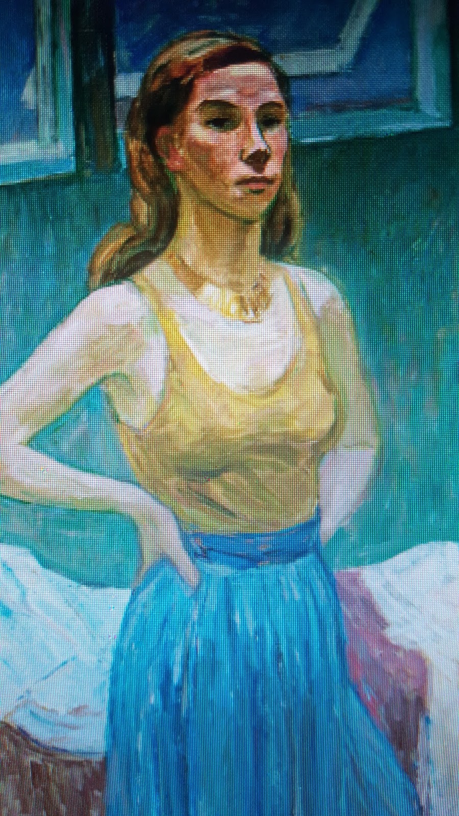
Spread over ten rooms it's a big show and it needs to be, some of the installations are huge, but we start off with Kabakov's painting. It's hard to pin down as so many styles were flirted with, abandoned, and then returned to. It's almost as if Kabakov wasn't so much interested in painting as interested in the idea of painting. While his 1959 Self-Portrait is 'unusually autobiographical' and atypically traditional it's still an utterly charming piece of work and captures the young man's intensity in a flurry of vibrant brush strokes dampened with muted mud tones. It's not dissimilar to the work of the young Cezanne.
Five years later Kabakov had moved on to Soccer Player. On first sight it's an innocent and playful picture of a young athletic, no doubt supremely fit, Soviet citizen, having fun with a ball but closer inspection reveals a partial view of a rural landscape and the Cyrillic word 'Uglich', a location of several Gulag prison camps. Kabakov's subversion of the form is an early sign of just how he'd develop his conceptual chops but at the same time keep the image easy on the eye. You can enjoy it purely aesthetically or you can delve in deeper. Kabakov allows you that choice.

Self-Portrait (1959)

Cubes (1962)
Cubes is the first of Kabakov's 'picture-objects', neither painting nor sculpture, neither wholly abstract nor entirely figurative. They're as much about the materials, which as a clandestine artist Kabakov found hard to source, as they are about the image. Even as late as 1980's Sobakin Kabakov was still drawing attention to bureaucratic intractability. The large wall hung work resembles a form containing the details of the life of the fictional Peter Nikolaevich Sobakin. Sobakin's surname has been chosen to reflect the Russian word for dog (sobaka) as if to say that the leaders of the Soviet Union saw artists, and indeed citizens, as no better than dogs.

Sobakin (1980)

The Bush (1961)

Hand and Ruisdael's Reproduction (1965)
Hand and Ruisdael's Reproduction seems to be designed purely to baffle and it's hard to know what to make of it except that's its intriguing. A curio but perhaps one where Kabakov, again, is trying on different masks, adapting different personas. If he's not Sobakin can he be the 17c Dutch landscape painter Jacob van Ruisdael? If he's not Ruisdael can he be the art world prankster who'd dare to leave a papier-mâché arm in the frame of Ruisdael's work?
If he's not that prankster could he perhaps be the fictional Socialist Realist artist that Kabakov invented, just before finally leaving the Soviet Union, for his dotty Holiday series? The back story Kabakov created for these works saw the original commission for these paintings cancelled and then put back into storage before being rediscovered and jazzed up with the introduction of a grid of sweet wrappers. It's Kabakov's tongue in cheek way of poking fun at the art establishment as well as the gatekeepers of taste that had banished experimentation in his country (the country of Malevich, Kandinsky, and Jawlensky) three years before he was born.

Holiday #1 (1987)
Holiday #2 (1987)
Holiday #6 (1987)
Holiday #8 (1987)

Pipe, Stick, Ball and Fly (1966)

The Queen Fly (1965)
As if hovering over the dead body of the Moscow art world, flies appear time and again in Kabakov's work and as if to draw attention to how far Socialist Realism was slipping away from advances elsewhere Kabakov depicted the fly both in a figurative and an abstracted form in the same 1965 oil paint and enamel work.

Head with a Balloon (1965)

Nikolai Petrovich (1980)

By December 25 in Our District... (1983)
A fly never stays in the same place for long and, possibly, Kabakov was referencing the insect's transitory nature as a cipher for his own itchy-footedness. In 1983's By December 25 in Our District, one of many works covered in sadly non translated Cyrillic text, we're shown the gap between the promises and the reality of the state. New construction projects sit abandoned as do the two actual shovels Kabakov has attached to the Masonite and we're left to ponder the unfulfilled promises of a utopian society. You could park a big red coach with a promise to pay the NHS £350,000,000 a week and it wouldn't look out of place. It's not just the extreme left who can't deliver the goods.
Other similarities with the Brexit brigade can be found in the desire to return to a gilded age that never was. 1981's Tested! is a rip of a 1930s Soviet painting and sees a woman being handed back her membership card for the Communist Party having satisfied some stern and, quite literally, faceless officials of her allegiance to the regime. Kabakov's mother had experienced similar treatment and the artist was struck by how these Socialist Realist paintings were so similar to those that sought to promote religious propaganda. In killing one God had the USSR simply invented another? It seems clear what Kabakov's thoughts were about this.

The Answers of an Experimental Group (1970-1)

Tested! (1981)
Things really get moving when we reach The Man Who Flew Into Space From His Apartment. You have to queue up to peek through the 'wall' of a room in a communal housing block. The walls are papered with propaganda posters and the doorway has been blocked but the former inhabitant, using a crude trampoline it appears, has launched himself into space thus escaping the humdrum reality of Moscow life and becoming part of the Soviet dream of space travel. If you look at this and think it looks like the sight of some deviant sex dungeon (as one of my friends did) then you clearly have the mind of a sewer.

The Man Who Flew Into Space From His Apartment (1985)

Incident in the Corridor Near the Kitchen (1989)
With Incident in the Corridor Near the Kitchen and Objects of His Life the exhibition really is heating up. So impressive are they that they shone a back light on the previous exhibits and made me appreciate them with new eyes. Art can do this. Art can change your perception and if you can change your perception maybe you can change your life? I hope so.
In the former the corridor itself has become a site of turbulence that jars, intentionally, with the idyllic paintings hung on the walls. In the latter Kabakov imagines yet another fictional character whose existence has been reduced to his belongings, now labelled like a museum's artefacts. It's not too different to the way many of us lead our lives now. My friend Neill once told me of an ex-school friend who on Friends Reunited (remember that?) simply listed an inventory of everything he owned.
We think we're more than that and, while we're alive, we are. When we die we live on for a while in memory and then we are nothing more than the things we once owned until we are then nothing at all. The Kabakovs ask whether the complexity of any individual's existence and personal experiences can be adequately reflected in material objects or institutional records. The answer is stark.

Objects of His Life (2005)

Trousers in the Corner (1989)
It's almost a relief to see a discarded pair of trousers flung in to the corner of the next room. Perhaps the sex dungeon spaceman left them there when he bounced off to Venus? More likely it's the Kabakovs, once again, reflecting on our impermanence. Our trousers will outlast us. They can go to an Oxfam shop, be bought, be worn again, as the bodies we inhabited slowly turn to dust and fade away just like the Soviet Union itself soon did.
This riffing on our mortality and our utter irrelevance in the grand scheme of things could be glum in lesser hands but the Kabakovs, like the film director Charlie Kaufman, has fun with it. We're all gonna snuff it anyway, might as well laugh about it, eh? Where is Our Place? imagines two exhibitions simultaneously taking place in one art gallery. One for big people. One for little people. Yet another comment on how some people's lives are considered more valuable than others. Death may be the great leveller but some parity in life is long overdue.

Model for Where is Our Place? (2002/2017)

Three Nights (1989)

Not Everyone Will Be Taken Into The Future (2001)
The piece for which the exhibition is named, Not Everyone Will Be Taken Into The Future, isn't the best thing here (guess it just had the coolest name) but it is one of them. Originally the title of an essay about Kazimir Malevich which Ilya contributed to under the pseudonym A-YA, it's been repurposed for a work that imagines Malevich as a visionary leading his people forward. A train is leaving the platform packed full of the chosen artists, the good and the great, and everyone else, the great unwashed, can only wave their hankies as their superiors depart for a brighter and better future.
The abandoned canvases of the failed artists stack up in the corner of the room unloved and unappreciated except for by the Kabakovs who always find it in their hearts, as ones who once moved in their number, to take a moment for them. If a person can be defined by the things they own then surely, more importantly, they can certainly be defined by the things they create?

The Colourful Noise #8 (2014)

The Window Into My Past (2012)
After a heavy, but proper fun, conceptual trip it was quite a surprise to enter back into the realm of painting again. Almost a relief for the eyes and mind. Great paintings they are too. Don't let it be said these conceptual dudes can't paint. Many of these works consider the theme of memory, not least the memory of the now gone Soviet Union. Fragmented and broken up images of soldiers, parades, totalitarian architecture, statues of Lenin, and idealised peasant women spin out at you like so many revolving newspapers in a black'n'white Hollywood film.
They're a riot of colour, a mess of half-remembered lives, they pine, they yearn, and they long. In the case of 2012's The Window Into My Past they even boldly reference Kabakov's own Tested! as seen earlier. Kabakov's own exhibitions are now as ripe for his critical scalpel as those of Malevich or the school of Socialist Realism. A critic's integrity can be measured by how deep they allow the knife to plunge beneath the tender surface of their own skin.

Model for Healing with Paintings (1996/2010)

Two Times #10 (2015)

Two Times #20 (2016)

The Appearance of the Collage #10 (2012)

The Four Paintings about the Sun #4 (2013)

The Man Climbing Over The Wall. Model for a Sculpture (The Eternal Emigrant) (1995/2004)
Architectural models, too, are put to borderline moralising use. In 2000, 55 years after Soviet soldiers seized the Reichstag from the Nazis and daubed it with Cyrillic graffiti, the Kabakovs proposed an artistic intervention in that building to frame and light the inscriptions that'd been left behind by these unsung heroes of Europe's liberation. It was another sign of how their work aims to speak for the little man and as it wasn't realised it's depressingly another sign of how the big man, like those in the two size gallery, doesn't need to listen to the little man. He can simply squash him.
In The Six Paintings about the Temporary Loss of Eyesight series the Kabakovs imagine themselves as an ageing artist possibly affected by deterioration of vision. Echoing the sweet wrappers of the earlier Holiday series these quite traditional, almost rustic, images are overlaid with a series of dots as if to imply this deterioration but also it hints at a new form of beauty. Things may not be the same anymore but there are new opportunities to be grasped if you want them.

Model for Inscriptions on the Wall (Reichstag) (1998/2000)

The Six Paintings about the Temporary Loss of Eyesight (They are Painting the Boat) (2015)
More serious still than loss of vision is, of course, loss of life. You'd need to spend all day and maybe longer in 1990's epic Labyrinth (My Mother's Album) to take it all in. Ilya Kabakov pictured the world in which his recently departed mother lived in as a long twisting, sometimes light, sometimes dark, corridor with a narrative that sometimes made sense but often didn't.
So he's made a long twisting, sometimes light, sometimes dark, corridor with a narrative that sometimes make sense but often doesn't to reflect that. Each corner suggests a bright new turn, hope for the future, but always opens up unto another grubby corridor that looks much the same as the last one. On and on and on and on and on until you reach the final door. We walk out into the gallery this time but it represents our slow trudge towards darkness, towards a time when another person wears our jeans or, worse, nobody ever wears them again. This all sounds depressing - and it is - but it's an excellent form of depressing. I hope that's coming across.

Labyrinth (My Mother's Album) (1990)

Labyrinth (My Mother's Album) (1990)

Model for The Five Steps of Life (2000/2012)
Ilya's now in his eighties, and Emilia in her seventies, and possibly unsurprisingly, and not least because they seemed pretty obsessed with it anyway, the last couple of rooms of this great Tate show seem to ponder what's beyond this mortal coil, our final reckoning, and the easy peace we feel as humans we need to make with those around us before we take our final curtain.Flight and wings become tropes in late period Kabakov work, like Chagall's lovers flying over Vitebsk but with a grainy Soviet (though not Socialist) realism that survived the journey across the Atlantic to Long Island where they now live. The flies of Kabakov's earlier works have grown into angels and migratory birds. The works have a wistfulness, a soft white/grey palette, and an assured acceptance that a life well lived is the best any of us can ever hope for. In How to Meet an Angel #2 a man has reached the top of an unsupported ladder ascending skywards to Heaven (from a large greenhouse it would appear!). It seems to me that the angel is telling him that it's not his time yet, enjoy the view, finish your work.
Of course angels don't exist. But human beings can sometimes do things that border on angelic, things that tell us life is worth living despite it's impermanence, irrelevance, and inequality. The artists Ilya and Emilia Kabakov, it turns out, are two such people. I might try being one myself.

How Can One Change Oneself? (1998)

Model for The Three Angels (2012)

How to Meet An Angel #2 (c.1997/2014)